Samaritan House: Visual Identity Rebrand
Context
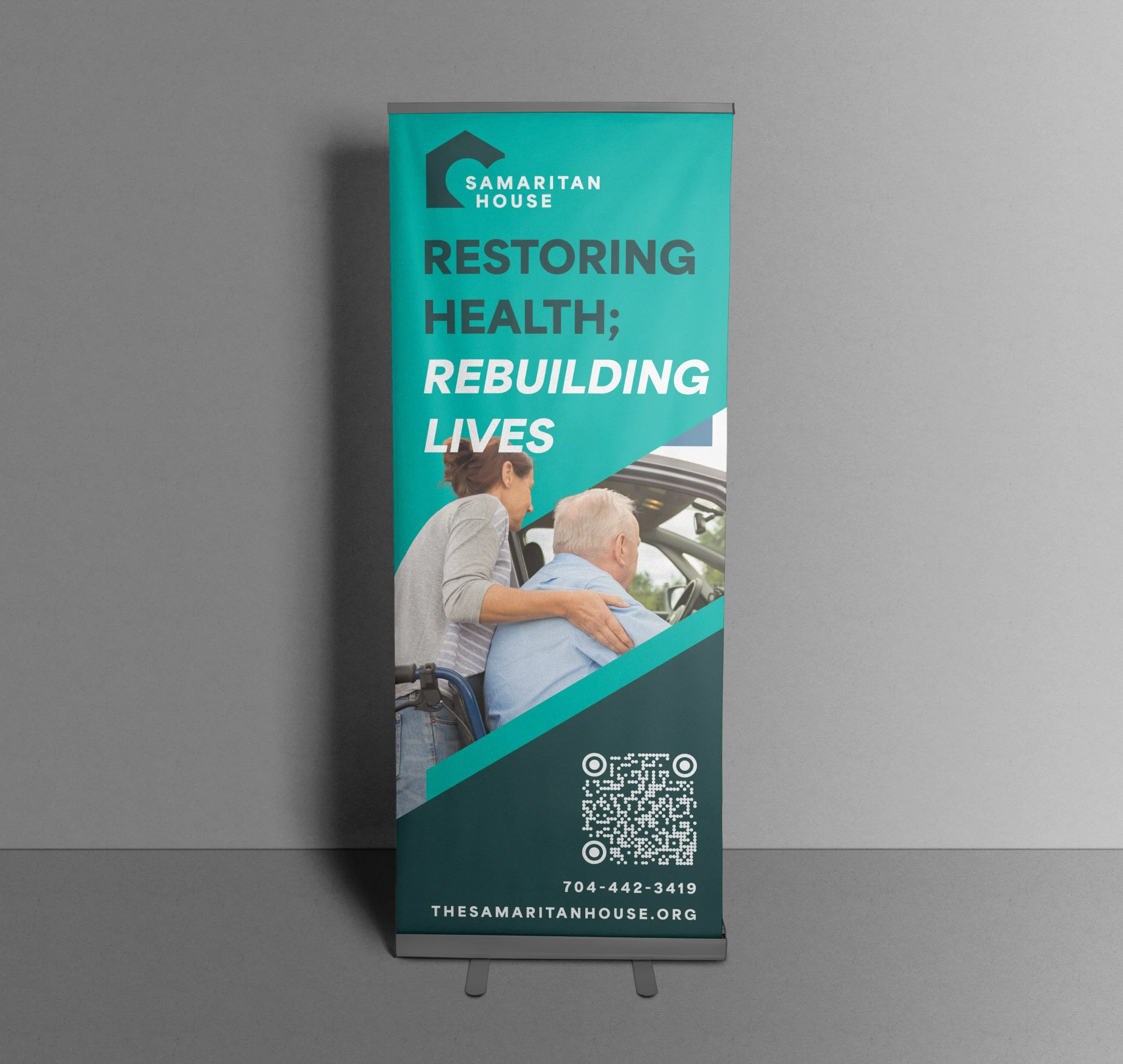
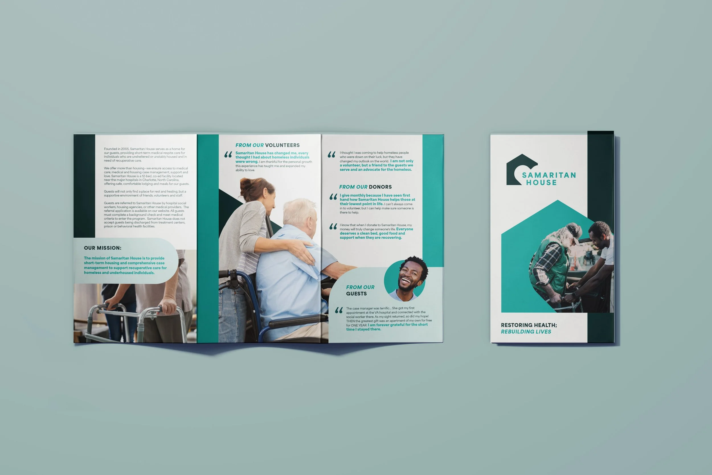
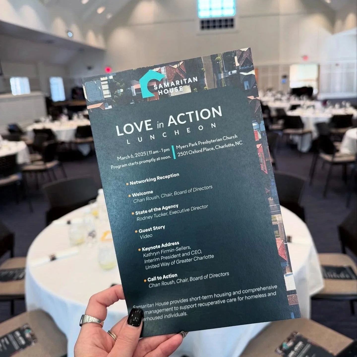
Charlotte’s only medical respite, providing short-term housing and care for individuals experiencing homelessness after hospital discharge.
Problem
An inconsistent, outdated brand made it difficult to communicate services with clarity and trust.
Goal
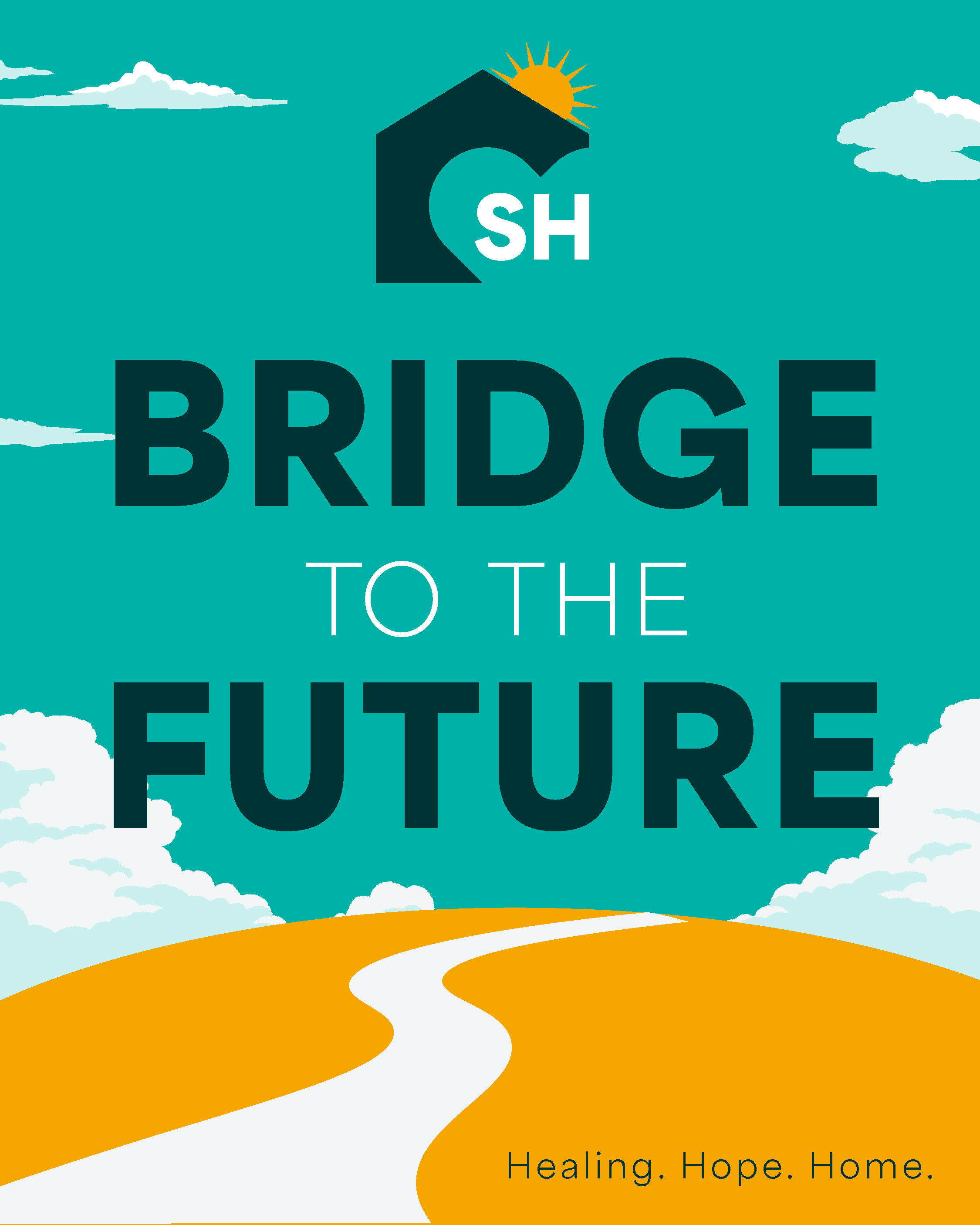
Create a cohesive, accessible identity that reflects care and dignity while working across all touchpoints.
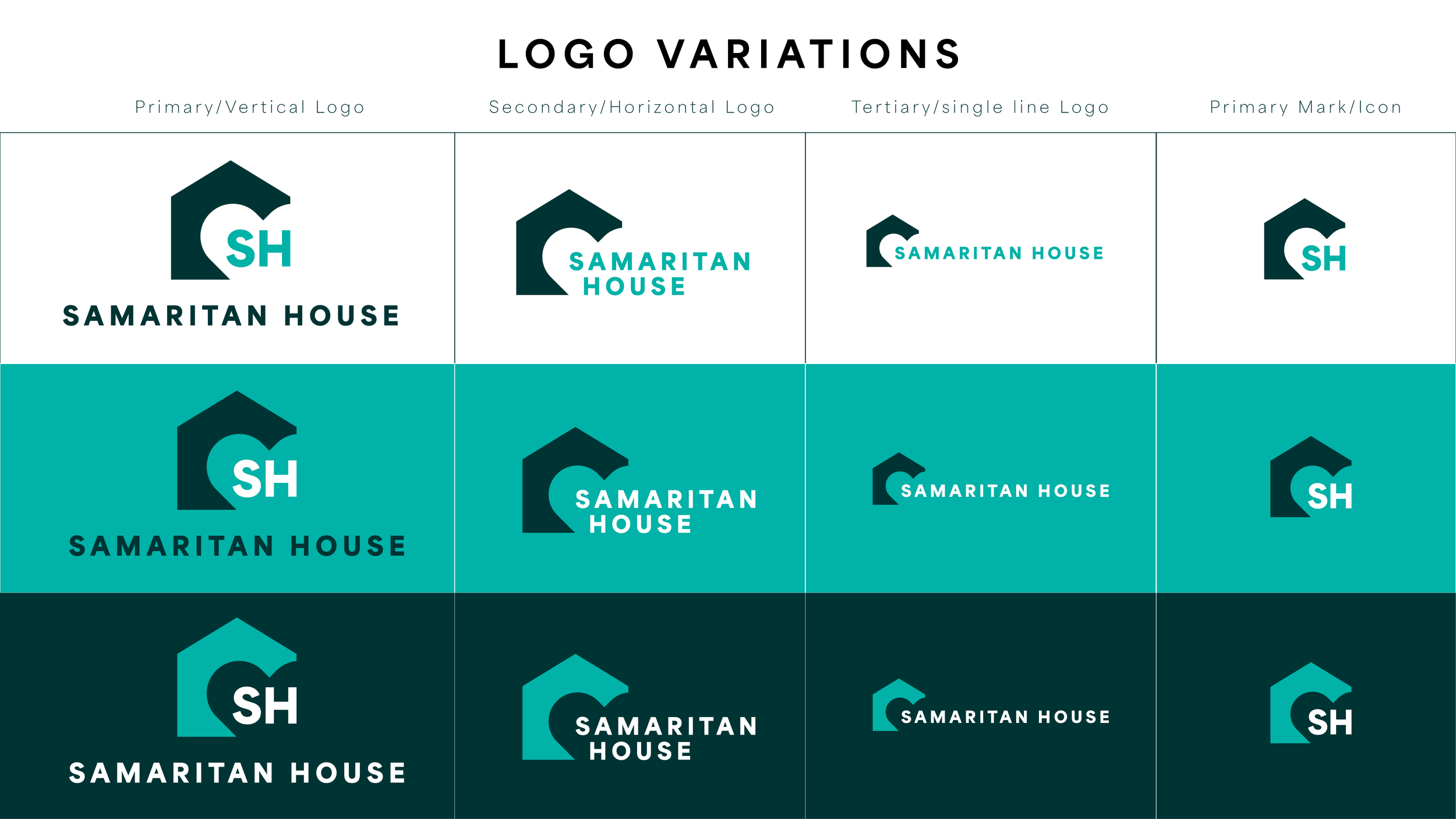
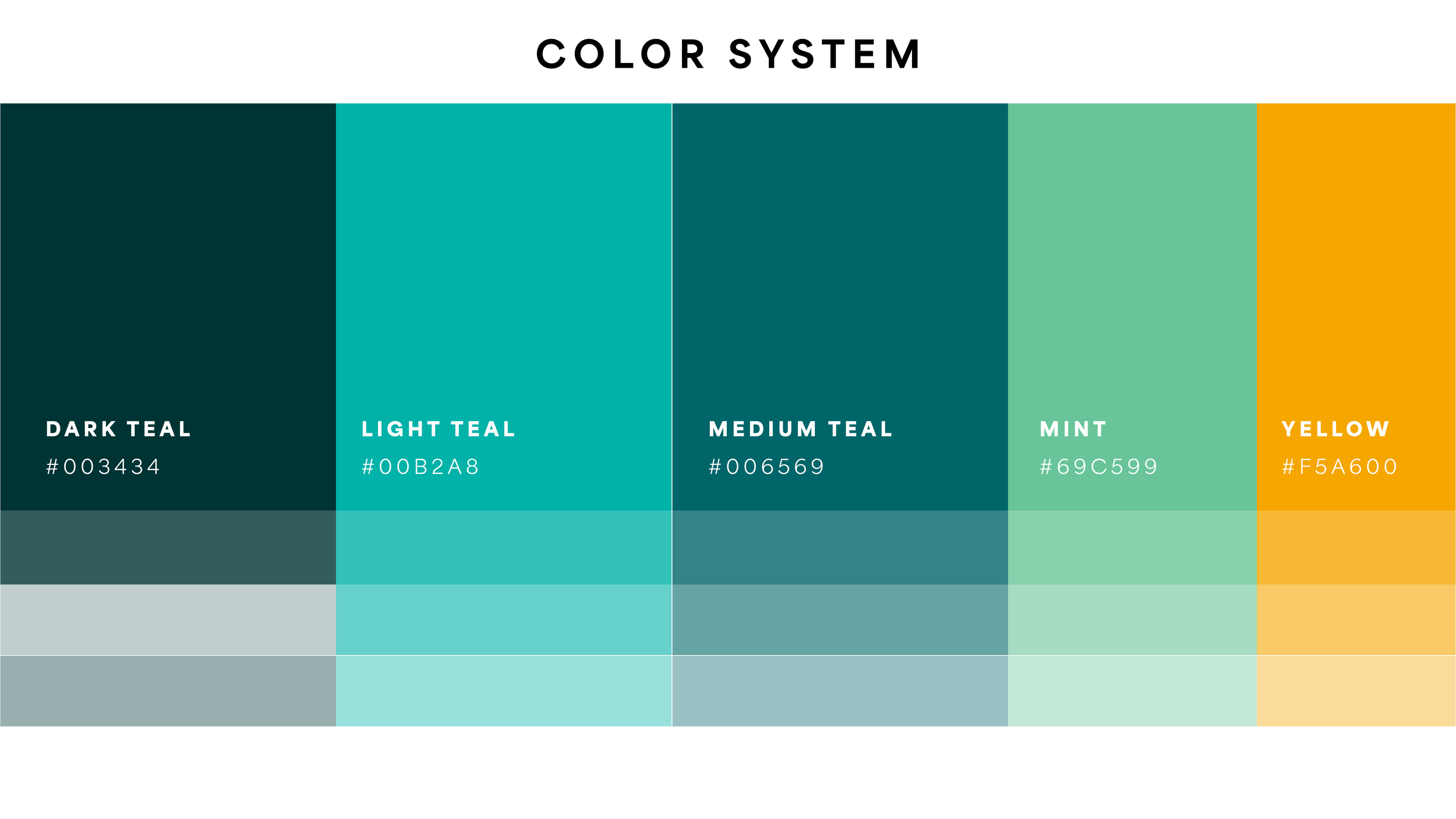
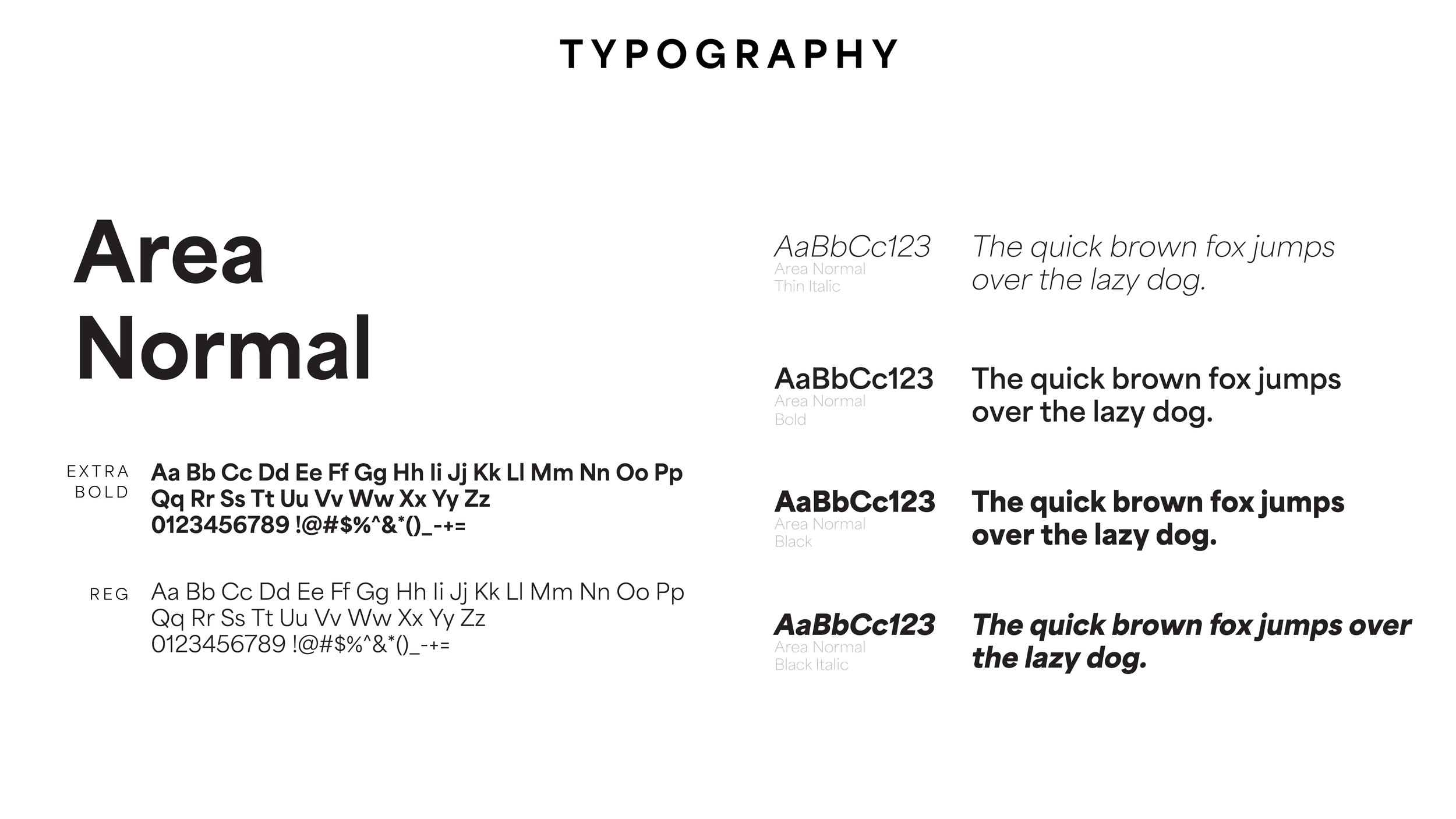
Approach
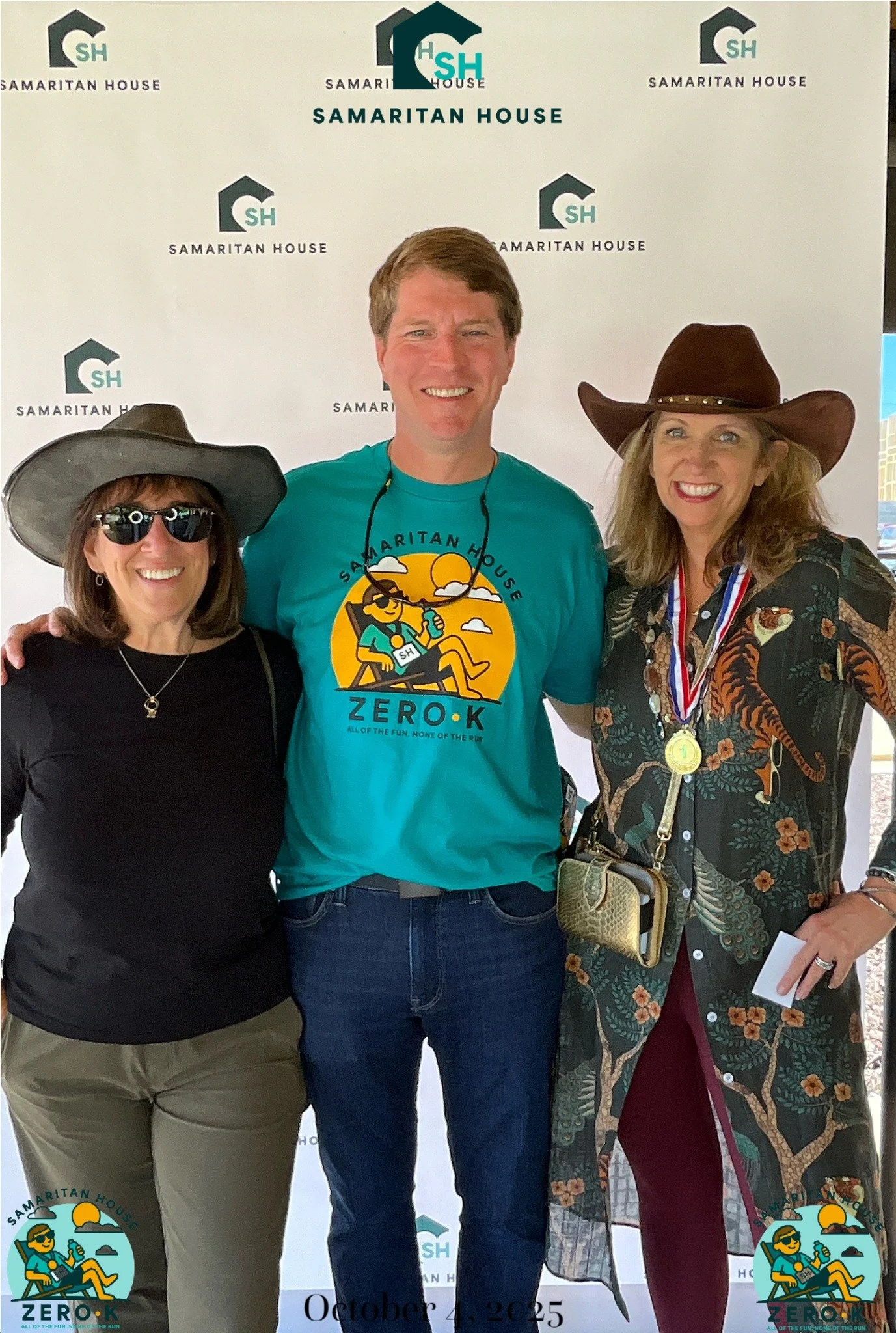
Built a flexible visual system and applied it across key materials.
Logo, typography, and color palette
Custom icon system
Brochure, signage, and social applications
Templates for ongoing use